Baseball Goobers

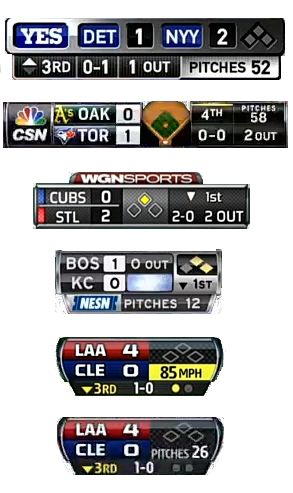
I’m talking about the little status-readout thingies that they have up on the TV screen when a ball game is on. Here’s one.
They present an interesting design problem.

The data on display is:
Team names: Two, conventionally represented as two- to four-letter strings.
Score: Two small integers.
Inning: One small integer, plus a one-bit top/bottom indicator.
Balls and strikes: Two very small integers, where by “very small” I mean they can be nicely represented as on-offs: three for balls and two for strikes.
Outs: One very small integer.
On-base status: Three one-bit values.
(Optionally) Speed of the last pitch.
(Optionally) Number of pitches from current pitcher.
I grabbed the samples at right from the MLB.tv broadcasts of the games that happened to be on this Sunday afternoon. The funny effects that arise when superimposing this on the live action, combined with my shaky Photoshop skills, make them a little jaggy. Sorry.
Design Goals · The display should be legible, it should be attractive, it should be small, and optionally it needs to have some branding, for the teams and the broadcast network.
I’m not going to carry on too much about the pluses and minuses of the samples on display here. It’s worth noting that the goober up at the top (from Canada’s Sportsnet), despite being twice the size of any of the others, actually works pretty well; it’s displayed across the bottom of the screen as opposed to up in a corner.
The top four goobers stacked up on the right each have some sort of network branding. The bottom two are, I think, what MLB.tv puts on the screen when they’re supplying the feed themselves, as opposed to using someone else’s. I supplied it twice to show how they switch the pitch speed and count. It’s praiseworthy if only because it uses the least amount of screen to deliver the data.
Comment feed for ongoing:
From: Joel Hamill (Aug 11 2013, at 15:06)
The bottom two are what the regional Fox Sports cable networks show. That is from the Fox Sports West broadcast of the Angels-Indians game. If you were to tune into a KC game on Fox Sports Kansas City you would see the same graphic.
[link]
From: Sean Watson (Aug 11 2013, at 15:49)
The bottom two are from Fox Sports-related entities; no network branding because they throw up a Fox Sports bug on the upper right-hand corner).
[link]
From: Ezra (Aug 11 2013, at 17:29)
I'd like to see someone do a vertically aligned one for baseball. I feel like unlike other sports which have a lot of horizontal movement, baseball doesn't really benefit from the widescreen displays. Especially the view from behind the pitcher to the batter. So it would be interesting to see how a vertically aligned one on one edge (similar to how Pardon the Interruption has their topics and the clock on one edge) or the other would work out. You could probably show even more info in it and still show the same amount of action on screen.
[link]
From: Rafe (Aug 11 2013, at 19:33)
I've been fascinated by these for some time. I'm pretty sure they date back to the 1994 World Cup, which was aired live in the US without commercials (except during halftime). The network needed a place to put ads, so they put the score and game clock on the screen all the time, along with a tiny ad. Afterward it was completely obvious that having the score on the screen at all times was tremendously useful, and they have become ubiquitous and substantially more information-dense since.
[link]
From: jcburns (Aug 12 2013, at 00:19)
Tim, goobers!?
The far more ahem, refined term that's in general use (even at other networks) for that upper-screen graphic is "Fox Box." Let me point you to the Wikipedia article, and a 2011 Grantland story on its history that is fairly accurate. It's also known (especially in sports other than baseball) as the 'Clock and Score' or the 'Scorebug.'
I got to design one in 3D once for a Verizon NFL Preseason game...had to come up with the WOOSHes and the tk-tk-tick sound effects as its components animated on and off as well.
[link]
From: Emyr Derfel (Aug 14 2013, at 01:01)
The left and right edges are subject to more variation (aspects, over scan etc) so can't be used.
[link]
From: Bob (Aug 15 2013, at 17:58)
My personal favorite is the Fox Sports one, but I think that's because I watch baseball on FS Florida all the time so got used to it.
[link]