Those Commies

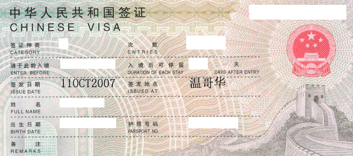
One of this week’s deliverables was a visa for the Shanghai trip. This involved a total of about five hours in line at the Vancouver PRC consulate, an unpleasant place; but the visa looks great.
Outside, there are the Falun Gong people complaining about being abused; inside, leaflets complaining about the Falun Gong being liars. Inside, it’s not notably worse than any other public-sector waiting room, except for the altercations. On several occasions there were outbursts of shouting and arm-waving, on one occasion involving security types hustling someone out of the room. Then when I got to the front of the line to pick up my passport, I had to wait 15 minutes because it was the official’s break time. During the wait, a woman barged in front of me and when snarled at in various languages, said something in English about being rejected and wanting her passport back. This developed into an extended shouting match, if I knew Putonghua I’d have learned the (probably terribly sad) story. Really quite nasty.
Note the good engraving and typography; I blanked out the data fields, leaving a couple to illustrate the nice lettering; I assume the “issued at” value is Chinese for Vancouver?
Comment feed for ongoing:
From: Barry (Oct 13 2007, at 15:04)
Yes, that's Vancouver in Chinese.
[link]
From: Michel S. (Oct 13 2007, at 15:58)
Interesting -- the first two characters are the same as that for Vancouver (http://zh-yue.wikipedia.org/wiki/%E6%BA%AB%E5%93%A5%E8%8F%AF), but the third character, not sure.
One of the great thing about an electronic document is that you can just copy-and-paste a CJK character and search for it in, say, a Character Mapper. Does not work for printed documents, alas.
[link]
From: Robert (Oct 13 2007, at 16:21)
It is indeed Vancouver. Mainland China uses simplified characters, whereas Taiwan and Hong Kong use traditional characters. The Wikipedia entry that was referenced used the traditional characters (you can switch to simplified, if you so desire).
[link]
From: Francis Chin (Oct 13 2007, at 18:44)
@Michel S.
The visa uses the simplified Chinese character set, and in this case the first and third characters differ between the traditional form (which you linked to) and the simplified one (see http://zh.wikipedia.org/wiki/%E6%BA%AB%E5%93%A5%E8%8F%AF).
[link]
From: Derek K. Miller (Oct 13 2007, at 21:31)
Speaking of typography, that visa exemplifies something that has long puzzled me: why, on so many items printed in Asian languages (Chinese, Japanese, etc.), do items printed in Latin script come in such a butt-ugly, super-thin, weirdly proportioned serif font? ("11OCT2007" is the example here.)
I've noticed it in many places, including clothing labels, warranty forms for electronics, stickers on electric fans, and so on. Is it because the standard fonts for Asian languages have lousy Latin characters in them? Or is it just traditional usage?
I note that "CHINESE VISA" and the field labels are in a pleasant sans-serif font, so it's not a universal problem. Any ideas?
[link]
From: John Cowan (Oct 13 2007, at 23:35)
What's more, the Wikipedia you are linking to is the zh-yue, or Cantonese, version.
[link]
From: Janne (Oct 14 2007, at 02:20)
Derek, as a guess it's because traditionally fields like that were filled in by typewriter, establishing that courier-like font as appropriate for documents. And as you don't use romaji for reading large blocks of text - and as your own script (Kana/Kanji in Japan, Hanzi in China) is fixed-width - there is no perception that the font is ugly or hard to read.
To put it this way: could you see a block of kanji/hanzi and determine whether it's an appropriate or beautiful one for the kind of text you're seeing?
[link]
From: Andrew Kobayashi (Oct 14 2007, at 02:50)
Regarding ugly Latin letters in Asian script - yes generally they are a part of the Asian font sets especially fonts that are part of the Ming Dynasty fonts (Mincho for Japanese). The Asian Gothic fonts are serif free.
[link]
From: Aristotle Pagaltzis (Oct 14 2007, at 03:57)
> I note that “CHINESE VISA” and the field labels are in a pleasant sans-serif font
That’s Helvetica. Heh.
[link]
From: Rick Jelliffe (Oct 14 2007, at 04:14)
On the subject of Latin characters in CJK fonts: very often the glyphs are designed (or the font chosen) with the following properties:
1) The letters should have the same stroke width as the ideographic characters. This is often quite fine, because there can be complex ideographic characters.
2) Letters can be set (i.e. typeset) fixed-width, each character taking the space of 1 ("full width") or 1/2 (halfwidth) of an ideograph.
3) Because ideographic glyphs are usually based on caligraphic brush forms, they don't tend to have the engraving or incision influence that alphabetic characters have. So fewer fonts have serifs in the same way.
So, put them all together: make a contant-width san-serif font with thin strokes. This is not all an easy task: consider the difficulty if making an acceptable "I" in particular.
Of course, when set by anyone with good graphical skills and for "display" use, then proportional width will be favoured, as in the visa. However, the font used still may have been designed or chosen because of 1) 2) and 3) above.
[link]