Mapping the Penalties of Failure

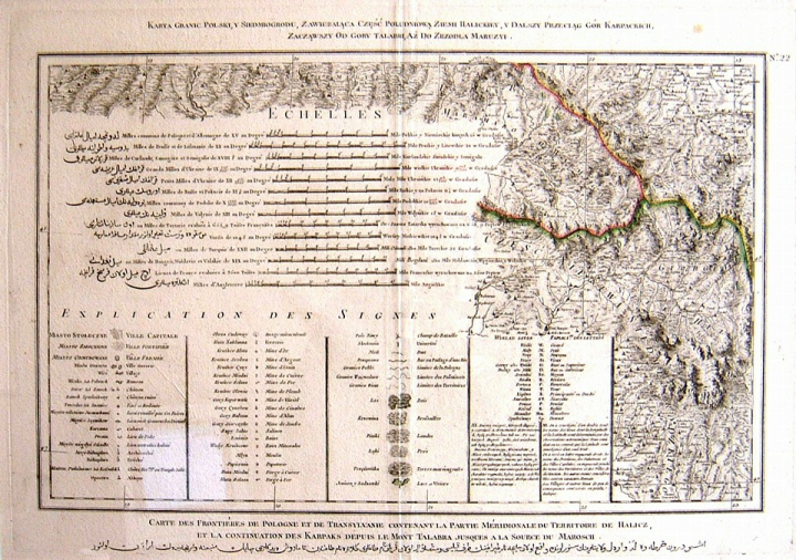
Below is a picture of of a map that hangs in my office; it shows an area in the Balkans and was created around 1790. I bought it in a dusty little bookstore in Juneau Alaska, but that's another story. It's inscribed in French, Polish, and Turkish (written pre-reform in Arabic script). Like many maps it's very beautiful, but it's more than a little weird, and carries an important lesson.
The weird thing is that there's not much map on the map, almost all of the area is filled with the legend; it seems like a dog is being wagged by a tail here. Is it merely that the cartographers were incompetent, or uncertain of their ability? Unlikely; a close look at the map part of the map reveals the excellence in lithography and typography that one comes to expect in old maps.
Here's the problem: they're suffering for their lack of standardization: the legend has to give the scale of differences in 14 separate units, albeit all correlated relative to a degree of latitude with a precision of one part in 2,000.
Even the names of the lands where the units of distance come from are more than a little exotic: Samogitia, Curland, Semigalia, Pokucia, Podolia, Volynia, Tartary, and Valakia, hardly household names today.
Looking at this, I'm reminded of two things. First, of the internals of many pieces of software I've written over the years, where a high proportion of the work, and of the customer's dollars, went into plumbing and data conversion and interfacing and a low proportion into the business logic they thought they were paying for. This is the kind of problem that XML helps with; buys you more map on your map.
Second, I'm reminded of the information density you can achieve with maps. Edward Tufte has a lot to say on this, but this map illustrates it really well. The maybe 30% of the map's real-estate that is primarily-graphical contains much more information than the 70% that is primarily-textual. And of course the 30% is still laden with text.
Obviously, this is the whole premise behind our work at Antarctica, and I like this map because it allows me to expound on both my main technical passions simultaneously.
Then there's that wonderful R.E.M. song, Maps and Legends.