Asynchronous Threaded Execution

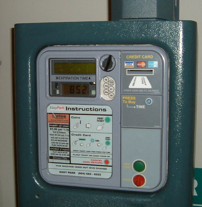
This parking meter exhibits some pretty fancy software technology, but with perhaps unintended consequences in the user interface department.
You put in your credit card, and you punch the button for each half-hour you want to park, up till 10, the maximum price for day parking. The problem is that the LED in the little window that shows you how much time you're buying can't update itself nearly as fast as you can punch the button. So the software, apparently doing something like threading, lets you "punch ahead" as much as you want, and the display catches up when it catches up.
This is fine once you know about it, you just punch ten times and hit the "print ticket" button. The first time I used the machine, though, I kept punching until the display showed "park all day", by which time I'd punched in the half-hour price about 15 times and would have ended up significantly overpaying.
So, do you design your user interface for the expert or for the first-time user? As an old Unix Hack, I'm solidly in the design-for-the-expert camp, but I did swear at the machine the first time it let me overrun the necessary ten punches.